Introduction to Net Income and Volume of Output
Introduction
Here we will look at the effects of changes in selling price, fixed costs, and variable costs on the net income and break-even point.
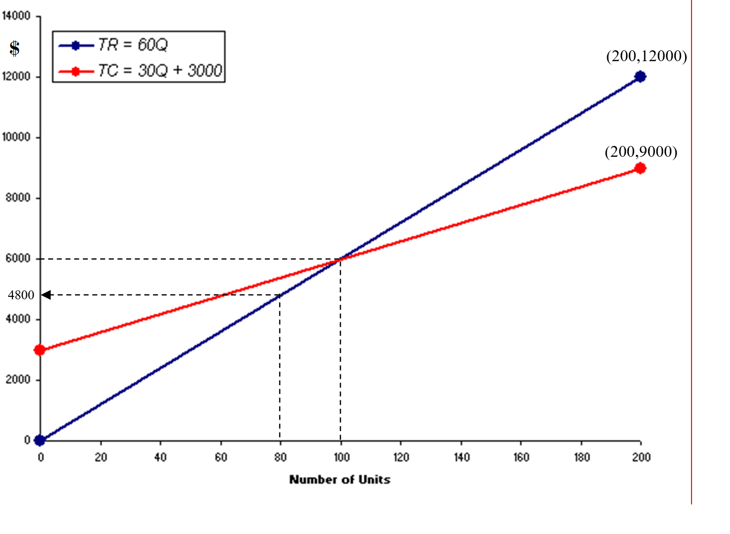
The use of graphs can also help us with break-even analysis.
We usually call the graph showing the total revenue and the total cost graphs together a break-even chart.
This chart is an easy visual way to analyze the financial position of a business for different number for units
sold (sales volume) or produced (volume of output).
We can see at a glance the amount of profit or loss that is generated for different levels of sales or production.
Net Income and Volume of Output
Example: The unit variable costs are $30. The selling price of the unit is $60.
The capacity for the period is 200, and the fixed costs are $3000.
Question: What is the net income at a volume of:
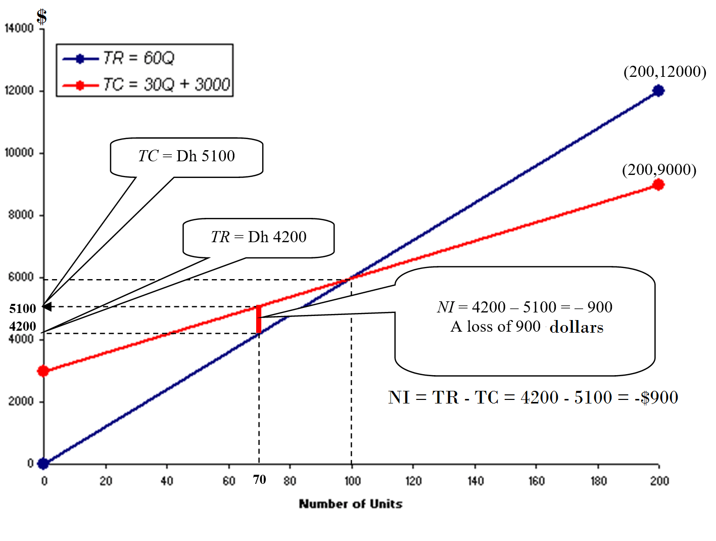
Scenario 1: 40% of capacity?
Solution:
Q = 40% of 200 = 80 units
TR = SP × Q = 60 × 80 = $4,800
The graph below shows the drawing of both equations: TR and TC:
The next graph shows that based on the current situation, the business is incuring a loss of $600.
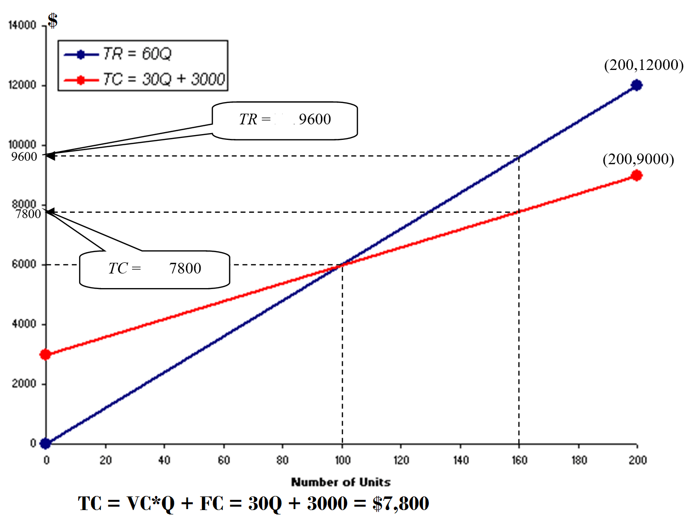
Scenario 2: 80% of capacity?
Solution:
Q = 80% of 200 = 160 units; TR = SP × Q = 60 × Q = 60 × 60 = $9,600
The graph below shows the drawing of both equations: TR and TC:
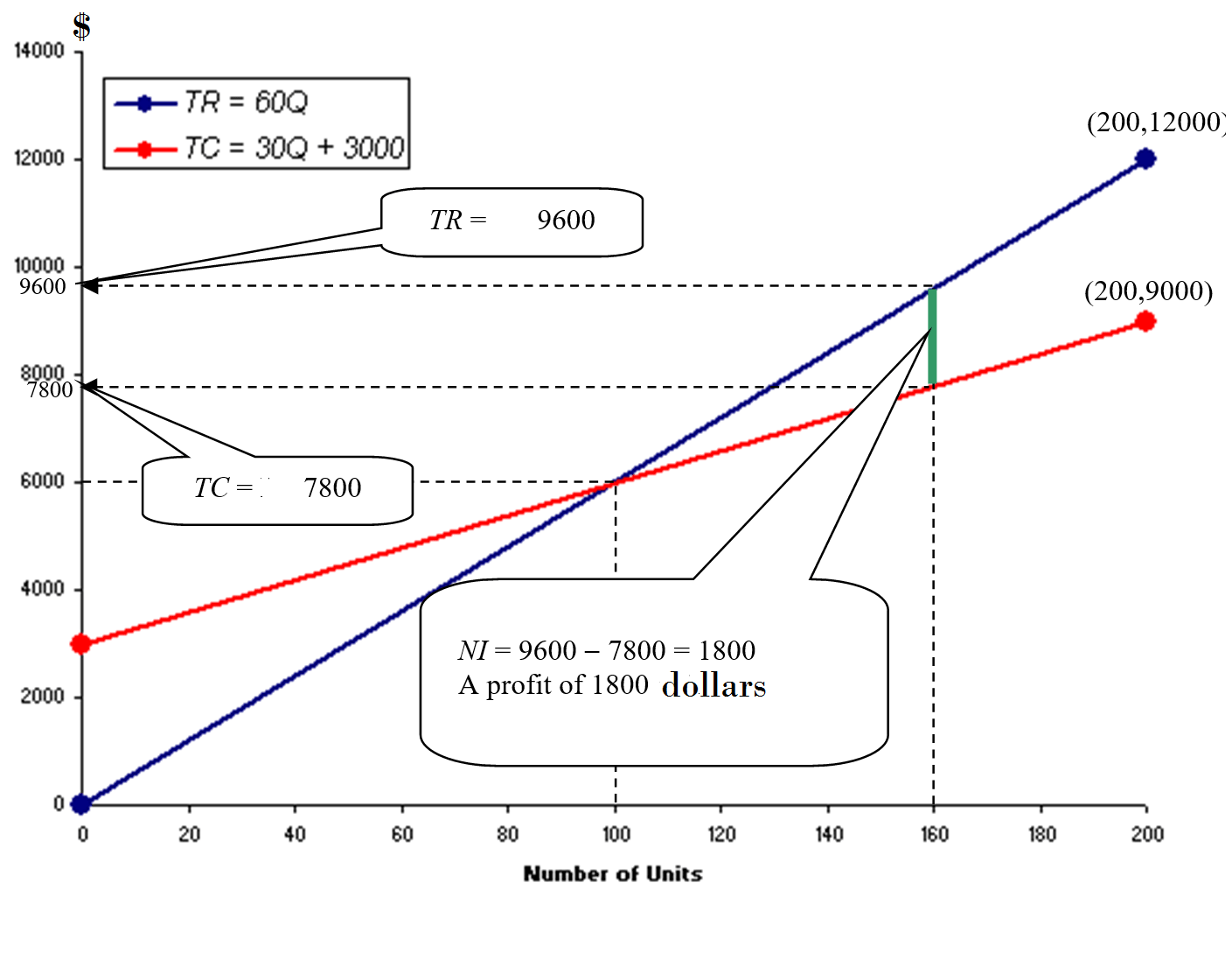
The next graph shows that based on the current situation, the business is incuring a profit of $1800.
For more details, please contact me here.